
TRISH RANDOLPH, OWNER
Randolph Design + Build; Oklahoma City, OK
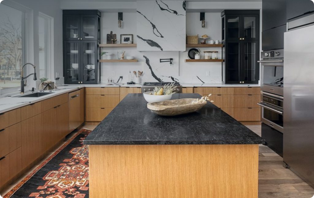
When Trish Randolph set out to select materials for the kitchen in this new-construction home, she wanted to pull together a mix of several different materials in a cohesive manner where they all worked together.
In particular, natural finishes as well as those reminiscent of nature were brought front and center to complement the island and perimeter’s wood base cabinetry and floating shelves that flank the range. For example, the Stratus Surfaces Unique Calacatta Black quartz used for the countertops, backsplash and ventilation hood surround is inspired by natural stone.
“It’s our statement piece for the space,” she indicates.
As a countertop surface, its non-porous nature enhances its durability and stain resistance that will help it stand the test of time.
“I like using quartz because it will stay beautiful for a long time,” she indicates. “Plus, there are a lot of choices, especially for white tones, which seem to be popular now.”
As a ventilation hood surround and backsplash, the prominently veined quartz commands attention, and keeps the eye moving around the room.
“The eye would stop if I would have used a different material for the hood,” she says. “I like that it keeps flowing.”
To complement the dramatic black veins, Randolph topped the island with Ebony Negresco granite in a honed finish that enriches the organic vibes within the space.
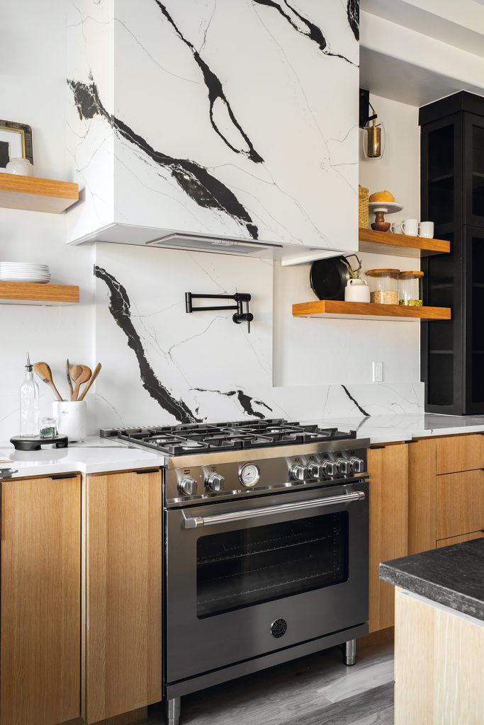
“Aesthetically, the natural stone works well with the quartz,” she says. “And, since the island will be a heavily used workspace, it serves as a sturdy surface that won’t stain.”
Its deep hue also ties in with the columnar black display cabinets, black cabinetry/appliance wall, black cabinetry hardware and black plumbing fixtures in the kitchen. And, as an open-concept home, it also complements the black dining room table and black fireplace in the adjacent rooms.
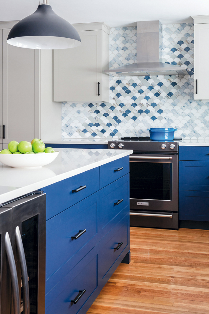
ROBERT MCGUIRE, OWNER
McGuire + Co. Kitchen & Bath; Wakefield, MA
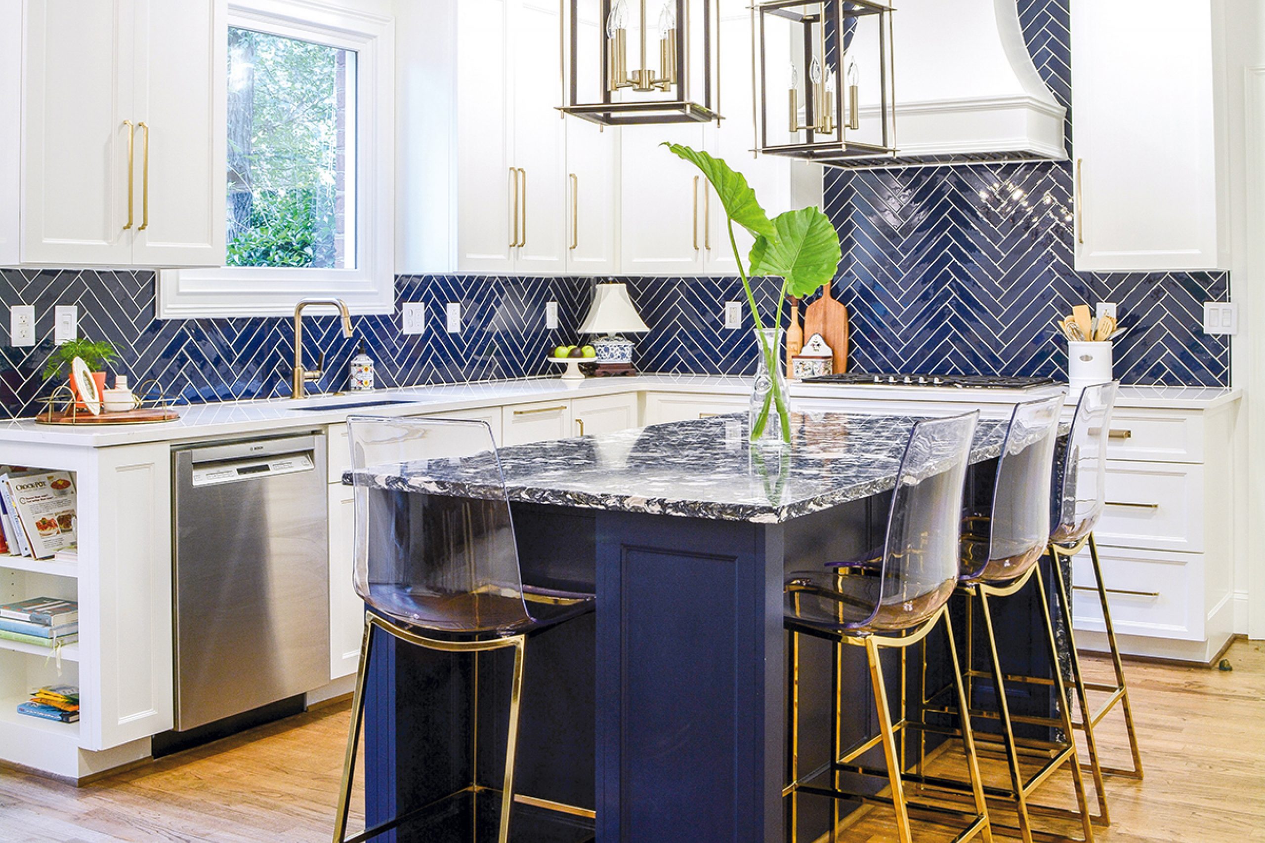
When a client loves color, it can be a great opportunity to incorporate interesting design elements such as cabinetry and/or backsplash options. In the case of this kitchen, both grab attention with the bright, naval blue base cabinetry, mixed with warm gray wall cabinets, serving as inspiration for the vivid backsplash tile behind the range.
“The wife really embraces color,” says Robert McGuire. “The kitchen cabinets in her previous kitchen were painted a soft lime green and she didn’t want her new kitchen to be a plain-Jane, all-white kitchen, so we kept things sophisticated yet interesting and playful with the two-tone cabinetry and the unique backsplash feature wall.”
McGuire and his team enjoy creating unique backsplashes when a project, such as this one, warrants the attention.
“There are so many beautiful and interesting tile and material options to choose from,” he says. “For this project, we reviewed many unique tiles with the client before landing on the beautiful glass ‘fan’ mosaic tile that complements the gray and naval blue cabinetry.”
The firm’s designer took it a step further by incorporating two colorways of the tile – Elysium’s Newport Scale in Beach and Loft – to create an organic wave of the bolder tile that draws the eye across the range wall and around the rest of the room.
“Who wouldn’t love being able to say their kitchen has a totally bespoke backsplash?” he queries. “It really enhances the space and pulls the entire palette of the kitchen together.” The team decided to keep the rest of the backsplash and countertop surfaces ‘quieter’ via Roca Tile’s 4″x10″ Joy
White subway tile that sheaths the window wall and Wilsonart’s Marble Falls quartz, which serves as the countertop surfaces for the island and perimeter.
“When a client is on board with a more daring backsplash, the countertop will likely be more neutral,” McGuire indicates. “Conversely, if the client has a particular stone or look in mind for the countertop, such as bold veining, we use that as the jumping off point and usually the backsplash will be quieter. It’s different for every project!”
Proportion and scale also come into play to ensure the backsplash and countertop work together harmoniously across the horizontal and vertical surfaces.
“Countertop material selection usually comes down to a client’s comfort level with a natural material like natural stone or wood versus an engineered surface that allows for easier maintenance,” McGuire explains. “Many of our clients are busy families, where durability and easy maintenance are key, so often we select engineered stone. Even still, there are many beautiful patterns and finish options, like a suede or brushed texture.
“To maximize functionality and durability, we’ll also consider details like fabricating a piece of stone backsplash behind the sink and faucet, usually up to a windowsill, to avoid grout lines in that high-use area,” he continues. “And, sometimes, the countertop and backsplash are one and the same, where the counter extends up in a slab backsplash for an ultra-chic, sophisticated and clean aesthetic.”
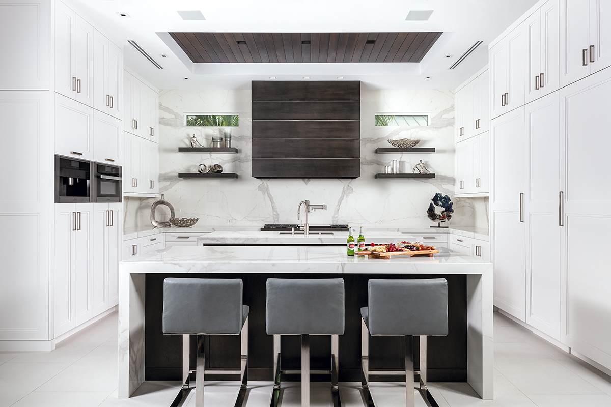
MINKA MCDONALD, PRESIDENT
Jinx McDonald Interior Designs; Naples, FL
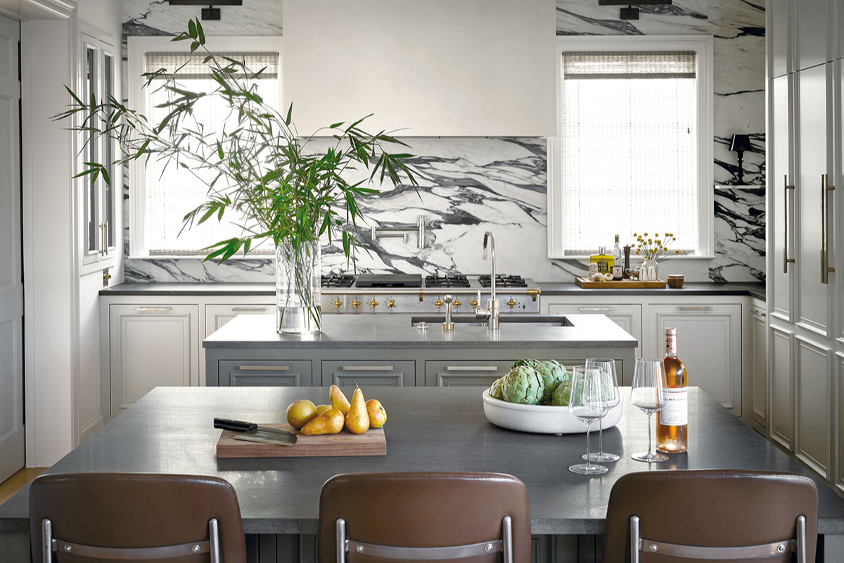
Countertop and backsplash statements don’t get much more grandiose than when made with Calacatta Statuario marble. The natural stone creates – and oftentimes defines – a timeless and distinctive aesthetic coveted by many, including Minka McDonald’s clients. However, the designer knew they needed something that offered greater durability as the work surfaces in their new kitchen, thus the selection of SapienStone’s Calacatta Statuario as the backsplash and double island countertops.
“My client loves the look of Calacatta marble,” she says, noting that its visual suited their request for a space that felt clean, current and elegant, as well as a bit masculine. “However, we needed something more durable and this porcelain Calacatta was the perfect solution.”
Like its inspiration, the porcelain’s white background and striking gray veins complement the palette created by the kitchen’s bright white cabinetry and dark charcoal rift cut oak hood, floating shelves, foundational island bases and ceiling accent.
“We wanted a material that would bridge the white and charcoal,” she explains. “And, since this porcelain’s pattern is mostly white, we could ‘waterfall’ the islands…without making the kitchen feel heavy and cumbersome. That edge detail created a strong, masculine feeling that, because of the material’s brightness, is simultaneously luxurious and light.”
McDonald and her clients also appreciate that the porcelain’s non-porous composition makes it extremely hygienic. Plus, it’s availability in large slab dimensions gave the designer the ability to bookmatch multiple pieces to create a stunning accent wall that matches the countertop.
“Using the slab as the backsplash on the large range wall pronounces the grandness of the kitchen,” she comments.
KIMBERLY KERL, OWNER
Kustom Home Design; Greer, SC
Kitchens are no longer the isolated work space they once were. With many of them open to living spaces, they are now part of the overall house design.
“People are putting a lot more design dollars into their kitchens, and they’ve become prettier and prettier as they have opened up more and more,” says Kimberly Kerl.
They are also often a reflection of the homeowners’ personality, taste and style, as was the case for this kitchen renovation, completed in collaboration with Sergio Custom Cabinets and Moon & McManus (contractor), where the bold cabinetry, countertop and backsplash selections echo the client’s outgoing personality.
While she wanted something bright and colorful, she also wanted something timeless and functional. Cambria’s Islington quartz, which serves as the island top, covers all the bases.
“The quartz replicates natural stone, which was appealing because it has a traditional feel…with a punch of color,” the designer notes, adding that MSI’s Calacatta Leon quartz perimeter countertops set the stage for the island to be the star.
Specifically, the Islington quartz’s dramatic blue tones satisfy the request for color, while its marble-like veining fulfills the wish for everlasting appeal. Adding a waterfall edge to one end showcases both on the vertical plane while an overhang on the opposite end allows for additional seating. As a composite material, the quartz offers durability and stain resistance, which were also important considerations given the family includes four young children.
Color is continued with The Tile Shop’s Nautical Blue glossy subway tile backsplash on the range and window walls.
“It was chosen to work with the [Benjamin Moore] Deep Royal island cabinetry,” she indicates.
Its herringbone pattern layout is traditional rather than trendy, and its high-contrast grout visually separates each individual tile.
“The white grout allows you to ‘read’ the pattern,” she says. “If I would have used a complementary color, or a color that coordinates too closely to the tile, I would have lost the pattern.”
While this client was on board with daring material selections from the start of the project, Kerl often encourages clients to be bold with their backsplash choices.
“A backsplash is typically easier than a countertop to change, if someone were to grow tired of it,” she says. “So sometimes we will pick a more neutral countertop and go bold with the backsplash. Also, if a project calls for a full wall of tile, the backsplash can be a bold focal point because of the shear amount of space it covers.”
SAMANTHA TOSTI, OWNER
Tosti Design; San Diego, CA
Samantha Tosti loves to use natural and handmade materials in her designs because they lend a timelessness that makes it difficult to pinpoint an era of origin.
“It’s harder to determine the ‘when’ of a space when these materials are used,” she explains. “I love their mystery, and that they age gracefully, rather than remaining pristine throughout time. They tend to become richer with age, telling a story along the way.”
Many of her clients also appreciate that timelessness, and these homeowners requested that natural and handmade materials be used for the construction of their villa, designed as a place for their family – and their dogs – to live, work and play.
“They wanted something they could pass down to their kids,” she says. “The idea was to have a home that didn’t look like it was just built. As we considered materials, it was refreshing that we didn’t go down the rabbit hole of Pinterest to find ideas with the same style. Instead, we got out, walked around and looked for materials they loved…materials that could have been used years ago, or could be used years from now. They didn’t want to look at their home and know exactly when it was built. It isn’t dated. Rather, it’s a comfortable place that feels like them.”
Texture was particularly important. As such, at the home’s foundation is nearly 10,000-square-feet of Vallangis French limestone flooring that runs throughout its interior and exterior, installed in a variety of textures and patterns to create interest. The limestone flooring also served as inspiration for the backsplash in the kitchen, where stacked limestone frames the range wall, accented with 2″x8″ antique terracotta tiles laid in a classic herringbone pattern.
Around the kitchen’s perimeter, Tosti added Tabarka Studio handmade off-white glazed clay tile that features a burnished edge.
“It was meant to blend in, but as you get closer, you notice its details and irregular edges…the imperfections that give it beauty,” she says.
At the kitchen’s heart is the large island, topped with creamy white Perla Venata quartzite in a honed finish that befits the home’s rustic style. Its thick 3″ profile adds ‘heft’ that supports the island’s large dimensions, while its live edge adds texture and interest. Arcing its silhouette eases the island’s transition into the adjacent great room.
“It doesn’t fit perfectly within the opening,” she explains, “so curving the edge keeps the island from feeling like it is randomly positioned. It allows it to transition organically into the next room.”
For continuity, Tosti repeated the Perla Venata quartzite around the perimeter where she specified a more traditional 1.5″ square mitered edge.
ANNE GRANDINETTI, CREATIVE DIRECTOR/SENIOR DESIGNER
Mark Ashby Design; Austin, TX
Anne Grandinetti generally chooses countertops before backsplashes, using the former as a way to build the design and following with the latter as a complement. However, for this kitchen, everyone fell in love with the bold veining of the Arabescato Corchio marble. And since the homeowners wanted a bold backsplash, the dramatic natural stone seemed a perfect fit to serve as the focal point in the room, sheathing the range wall from countertop to ceiling. The designer also wrapped it around to the breakfast area on the opposite side of the kitchen.
“The marble creates a stunning visual, elevating the kitchen from a utilitarian space to a desired place to entertain,” she says, noting that a theme of statement-making marbles is showcased throughout the home, including the Calacatta Viola marble, which makes an appearance in the home’s dining room. “It’s really a bold, beautiful piece of art.”
The Arabescato Corchio marble’s mix of white and various shades of gray also sets the tone for the direction and color palette for the space, with the lighter hue being supported by the cabinetry and the darker color tones represented by the honed Basaltina lava stone that serves as the countertop surface for the double islands and perimeter.
Although not as flashy visually as the marble, the more subtle natural stone doesn’t necessarily take a back seat in the design. Rather, it shines when taking into consideration functional needs of the clients.
“Choosing backsplash and countertop materials is client driven,” Grandinetti indicates. “We need to consider how durable a space needs to be, especially in a working kitchen. For instance, do the clients care if a stone gets patinaed or etched over time?”
In this kitchen, the homeowners are considerable cooks and they love to entertain, so durability was important.
“Since marble is a porous surface, we chose to use it in spaces that wouldn’t get heavily used, such as the surrounds and backsplash,” she continues. “For the countertops, we needed something very durable, and the hearty lava stone works great as a workspace. It holds up better, is more durable and requires less maintenance [than marble]. We use it quite often for projects and we always hear great feedback about it from our clients.”
Plus, the lava stone’s consistent visual with minimal striations blends beautifully with the mid-colored veins in the more-forward marble, creating an overall elegant aesthetic.
“It’s a very consistent stone with a clean look,” she explains. “It complements the boldness of the marble, creating a pause from the heavy movement of the veins. The two stones go together beautifully.”
Both stones are also complemented with a mix of metals, including Polished Nickel plumbing fixtures, White Bronze cabinetry hardware and Oil Rubbed Bronze picture lights that support an overall organic vibe and prevents the space from being too matchy-matchy.